A logo shaped by nature, reflecting our nature-based social care
At Camphill Village Trust, nature is not an add-on to our work – it is fundamental to how we provide care and support. Our newly refreshed logo has been shaped with this in mind, acting as a visual expression of our nature-based social care approach and the lived experience of the people in our communities.
This update is a gentle evolution, not a reinvention. It strengthens what has always been at the heart of Camphill Village Trust: support rooted in nature, care and craft.
A visual reflection of our nature-based social care offer
We are a nature-based social care provider. Across our communities, the people we support live and spend time on acres of land – farms, gardens, woodlands and open green spaces. These environments are integral to daily life, offering opportunities for meaningful activity, therapeutic support and skills development.
This approach is brought together through our Nature-based Therapies and Skills Programmes, which use nature as a foundation for improving overall wellbeing, physical and mental health. Activities such as horticulture, land-based skills, conservation work and seasonal rhythms provide structure, purpose and connection, supporting people to build confidence, resilience and independence.
Our refreshed logo reflects this offer directly. Inspired by wood slices and tree rings, it mirrors the landscapes where our support takes place and the steady, natural growth we see when people are given time, trust and the right environment to thrive.
Growth, time and individuality
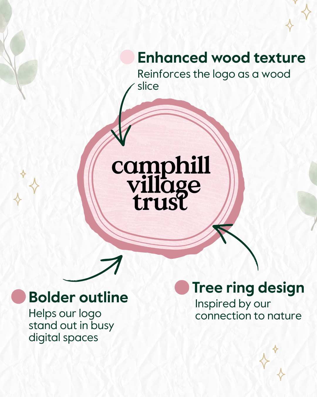
The bolder outline of the logo helps it stand out more clearly in busy digital spaces, while the enhanced tree-ring and wood-slice textures reinforce our connection to the natural world. Tree rings symbolise growth over time; a powerful parallel to our long-term, person-centred approach to care.
The base of the logo represents a wood slice, and its unsymmetrical, organic shape reflects our belief that every person is unique. Just as no two wood slices are the same, no two support journeys are identical. Our nature-based approach allows people to engage in ways that suit their interests, abilities and aspirations.
Our typeface, inspired by the Arts and Crafts movement, connects to our artisan roots and to learning through doing, an approach that sits naturally alongside our nature-based therapies and skills development.
Interlinked people, places and support
A small but meaningful detail within the logo shows the ‘g’ forming the cross of the ‘t’. This reflects how our communities work best when people, land and support are interlinked.
Nature connects everything we do, from homes and care to learning, skills and wellbeing. Our logo brings these elements together in one simple mark, symbolising the joined-up way we support people to live lives of opportunity.
A logo that tells our story
We’re excited about this gentle refresh and what it represents. Our updated logo is more than a design update; it is a clear reflection of our nature-based social care offer and Nature-based Therapies and Skills Programmes at the heart of our communities.
We hope you enjoy seeing this new expression of Camphill Village Trust!


